Case
Fictivt
Programe
Figma, Illustrator
Role
UX, UI designer
Team
Petronella
Time
77h
Background
Many people tend to buy too much food, which leads to increased waste. Additionally, we should increase our intake of plant-based foods to improve our lifestyle. Goal 12 of the UN's Sustainable Development Goals is: "12.8 Increase public awareness of sustainable lifestyles."
Digital shopping via e-commerce is booming in Sweden, with food and grocery shopping online accounting for 44% of purchases among the 25-39 age group. Samsung has a refrigerator with a digital display that has received much criticism for poor design and user experience. The task is to improve the home screen and align it with the UN’s goal of sustainable living while integrating a seamless way to order groceries from the company Ekoland. Additionally, how can AI solutions further enhance the product?
Process
I began by reading reviews of Samsung's digital fridge display to understand what users felt was missing or considered unnecessary and could be excluded. A significant amount of feedback was focused around the difficulty in navigating and the complexity in understanding where to push.
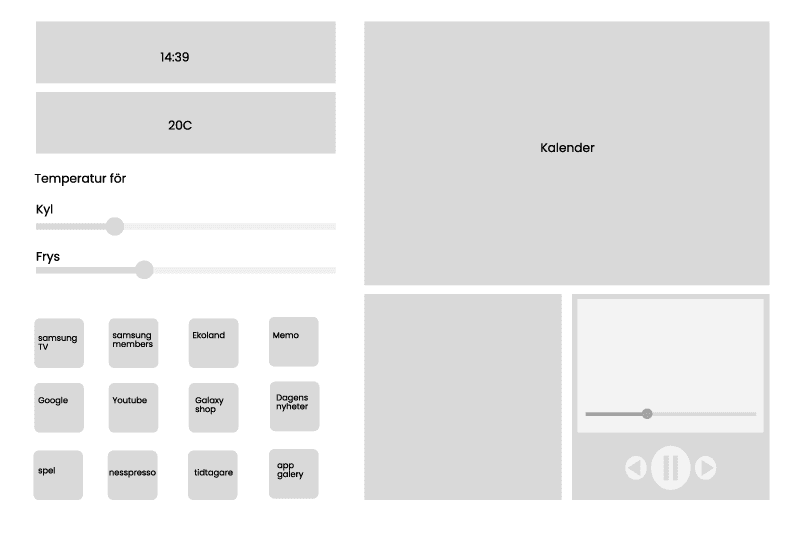
After that, I sketched greyboxes for both Samsung's display and Ekoland to outline my ideas. After that, I conducted user tests with my friends to get a sense of whether my design was easy to understand and sustainable in the long term.
Design choices
I used Samsung's visual identity for their display.
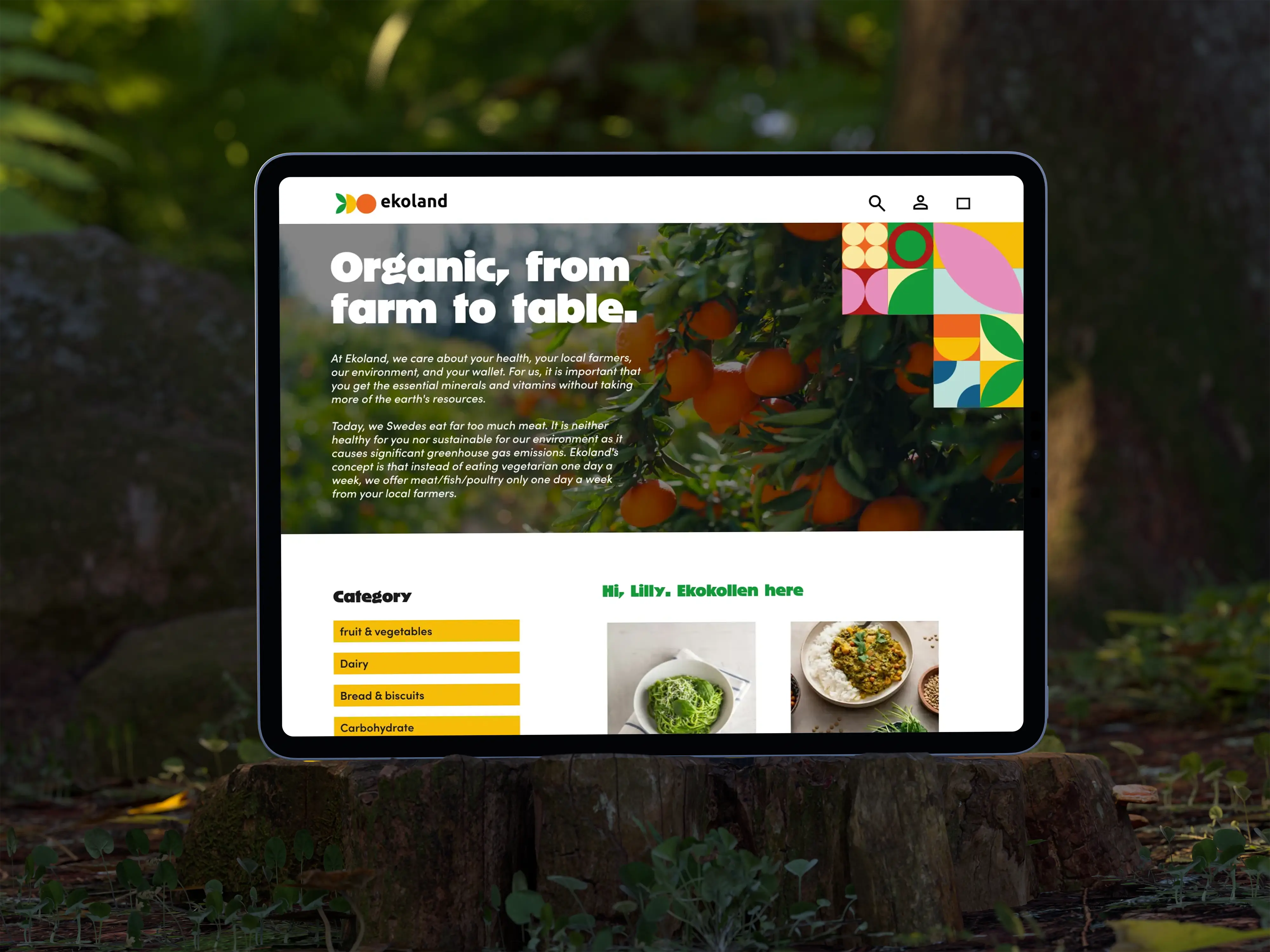
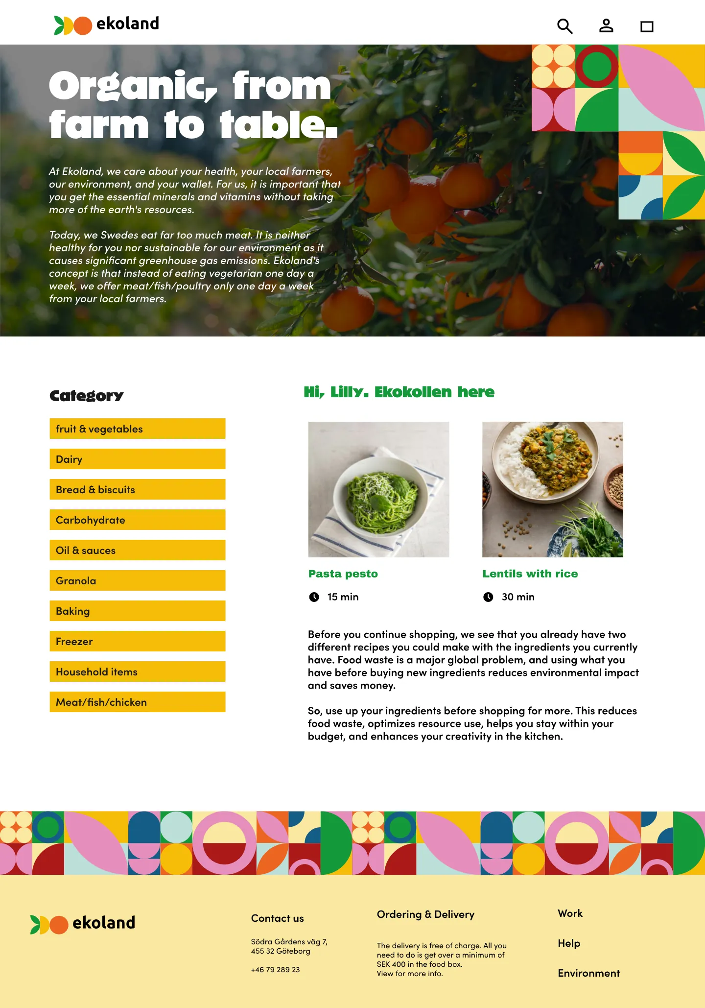
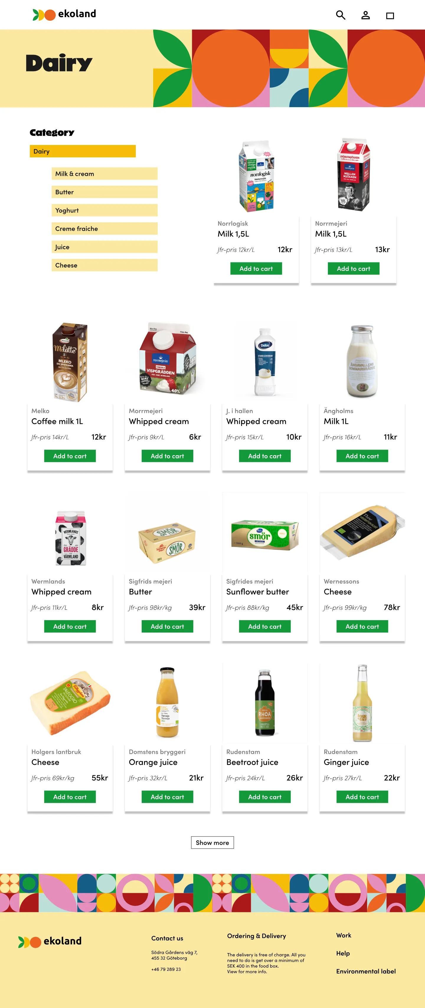
Since Ekoland is a fictional company, I created its visual identity. I developed the logo, typography, colors, and graphic elements. I chose to design with various shapes to highlight the natural ingredients and their characteristics. The eight different vibrant colors represent natural ingredients like basil, orange, chili, blueberry, and more.
The logo is based on shapes that convey an understanding of Ekoland’s service. Typography plays an essential role in the design. I opted for a bold and strong typeface for the headlines, to grab attention but also to evoke curiosity. Visiting Ekoland's site should feel playful and inspiring.
Solutions
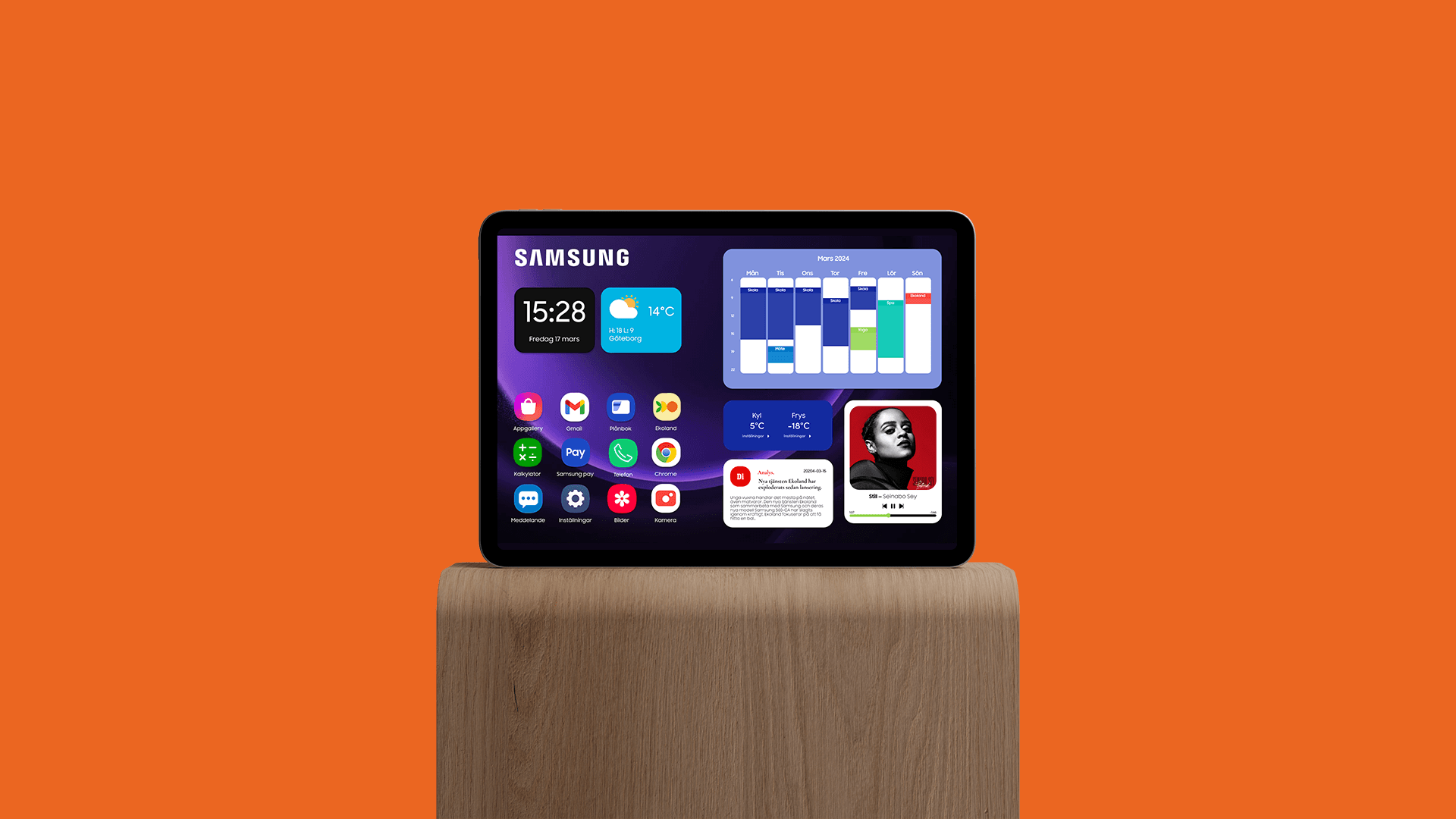
The design of Samsung’s display includes weather forecasts, a calendar synced to your mobile, news, Spotify and various applications, including Ekoland. After feedback from the user tests, I made some design adjustments, including changes to the temperature settings for the fridge and freezer.
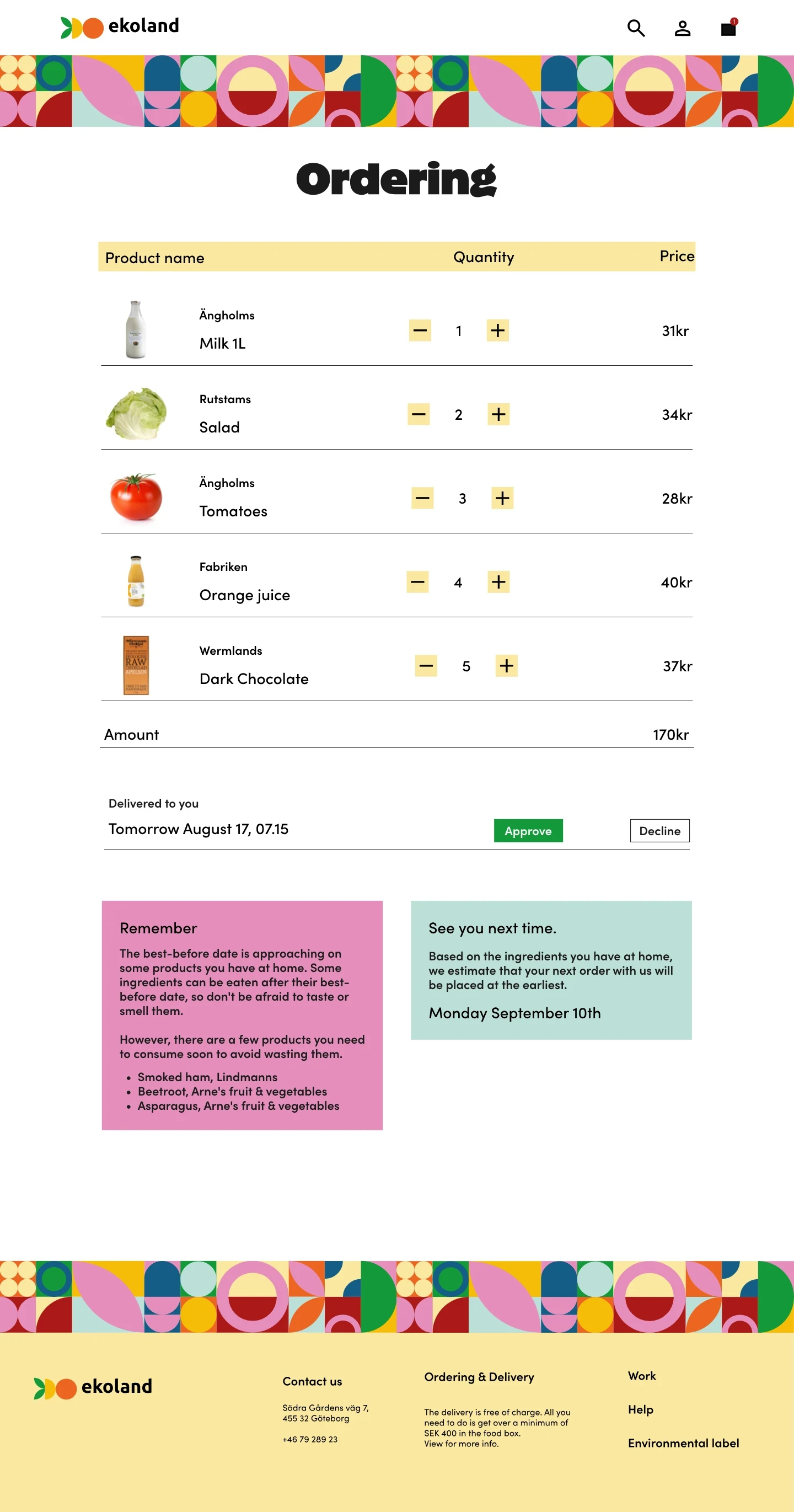
Ekoland’s navigation is simple, without unnecessary buttons. The user selects a category from the left side, add items to the cart, and when being done shopping, you push the cart in the navbar. In the cart, the selected products are summarized along with quantities and prices.
To reduce food waste and help customers get a better overview of what's in their fridge, AI compiles information for you. The fridge has sensors that detects what's inside, what comes in, and what goes out. The post-it note called "Remember" tells you what needs to be eaten immediately, and "See you next time" mentions when you need to shop at Ekoland again.
Reflections
It’s important to conduct many user tests on your design. Are there any issues with the design? Will the user understand where to click to get the information?
I’ve also learned to use design systems and components to streamline my work and maintain structure and order in the Figma document. Thorough sketching also helps simplify and save time when it’s time to apply the visual identity.

