Case
Sharp project
Programe
Figma, Illustrator,
After effects & Webflow
Role
UX, UI designer
Team
Petronella, Katarina
& Alfred
Time
80h/person
Background
Yrgo has had a partnership with Chalmers Venture companies for a long time, helping startups with various aspects of design. My group was assigned the company Archeri, which works with dynamic capacity management and calculates the exact network capacity in real time. The best part being that they can do this without adding new hardware. The value their solution can bring to power grid operators is enormous. Their customers are B2B.
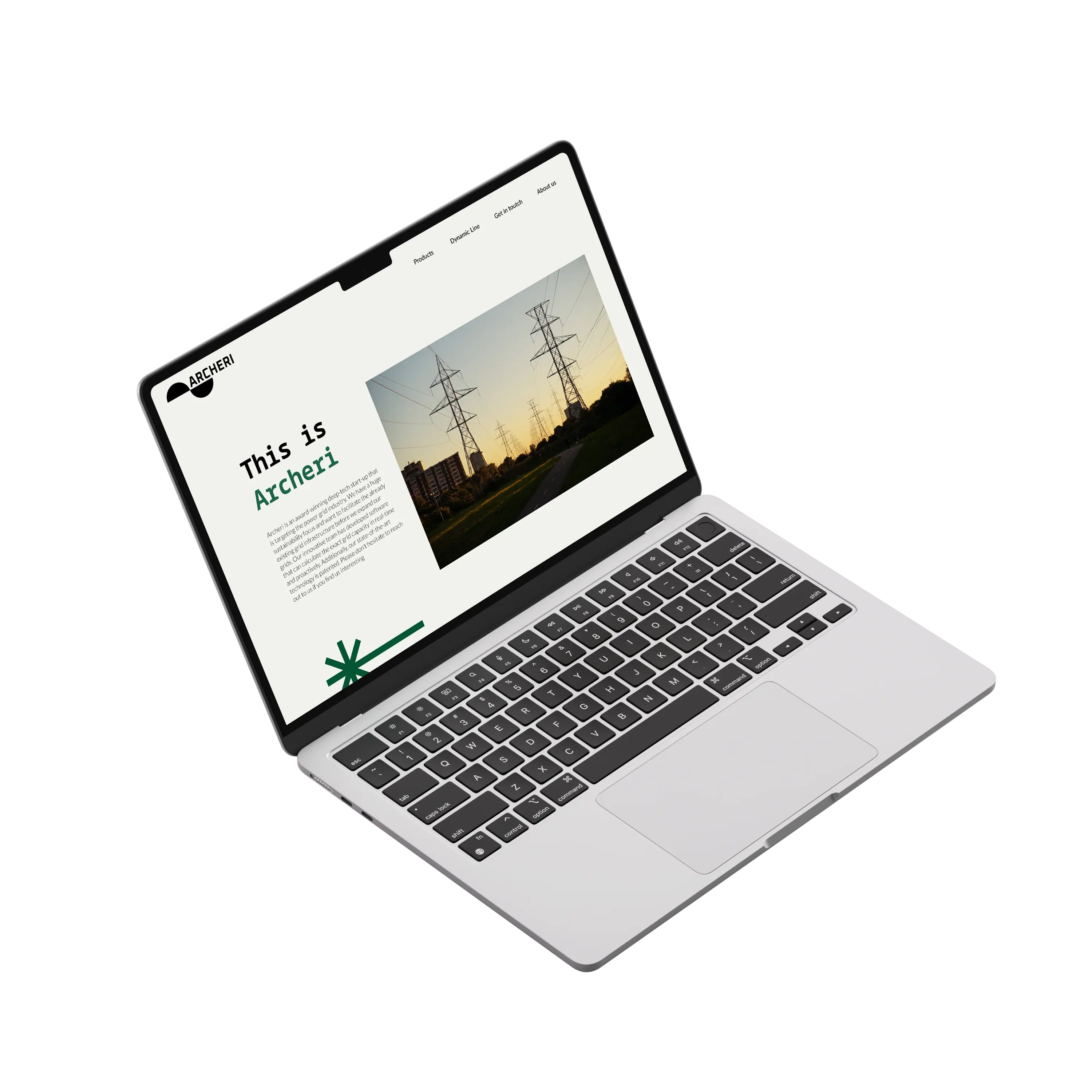
Archeri needed a graphic identity, which was to include a new logo, typography and new colors, as well as a website designed to convey information about what they do, including a contact form.
Process
Our team decided to design three different stylescapes, each including a logo, typography, color scheme, and graphic style. This was to give the client a visual understanding of the design and how it might look.
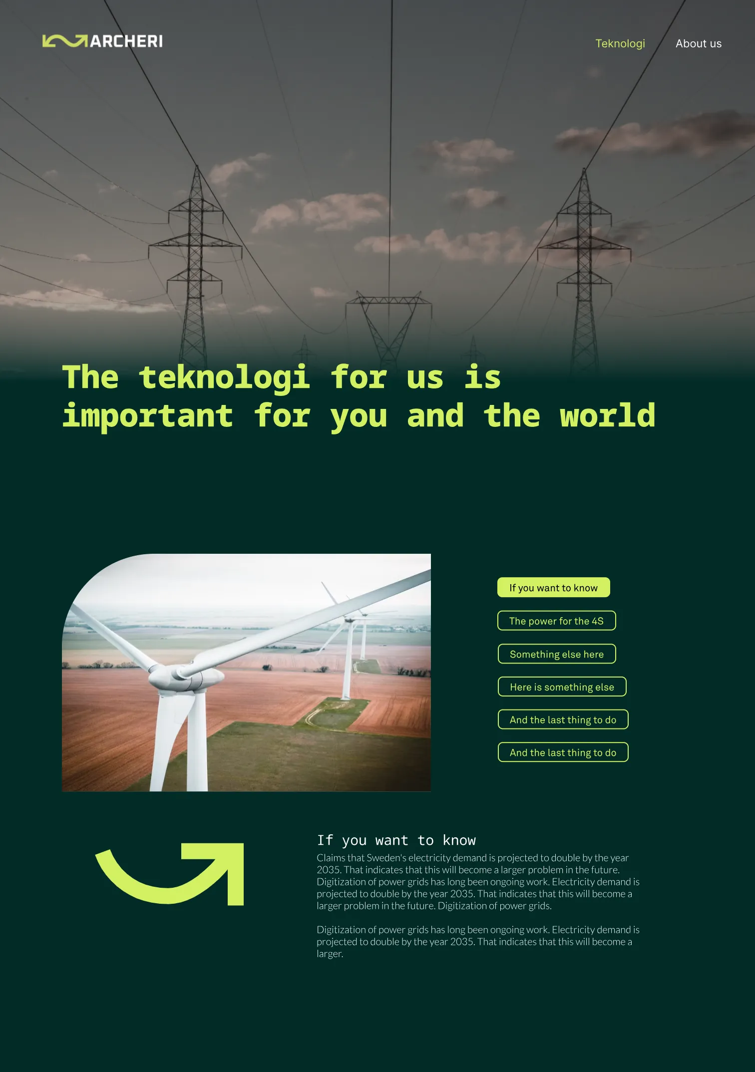
My task was to design a stylescape, being focused on a dark and bold mood to make Archeri stand out from its competitors. I researched similar companies working within the energy sector, realizing that they generally use bright and earthy colors. Energy is about electricity, efficiency, and power, which aligns better with strong colors. I wanted to create something that stands out, making Archeri memorable.
Design choices
The logo is a reference to the sine wave, conveying a sense of movement.
Typography is a key part of Archeri's visual identity. I chose Noto Sans Mono, a monospace typeface, meaning each character has a fixed width and occupies the same amount of space. This reflects Archeri's product, which emphasizes the even distribution of energy. The Lato typeface, a sans serif, was chosen for body text, conveying a sense of reliability and timelessness.
The primary color for Archeri is a vibrant green called "Energy," which communicates efficiency and power. This bold color serves as a clear identity marker for the company, chosen to catch visitors' eyes and evoke thoughts of electricity.
In addition to colors and typography, I designed a graphic style aimed at enhancing visual communication and serving as a strong complement to text and images.
Solutions
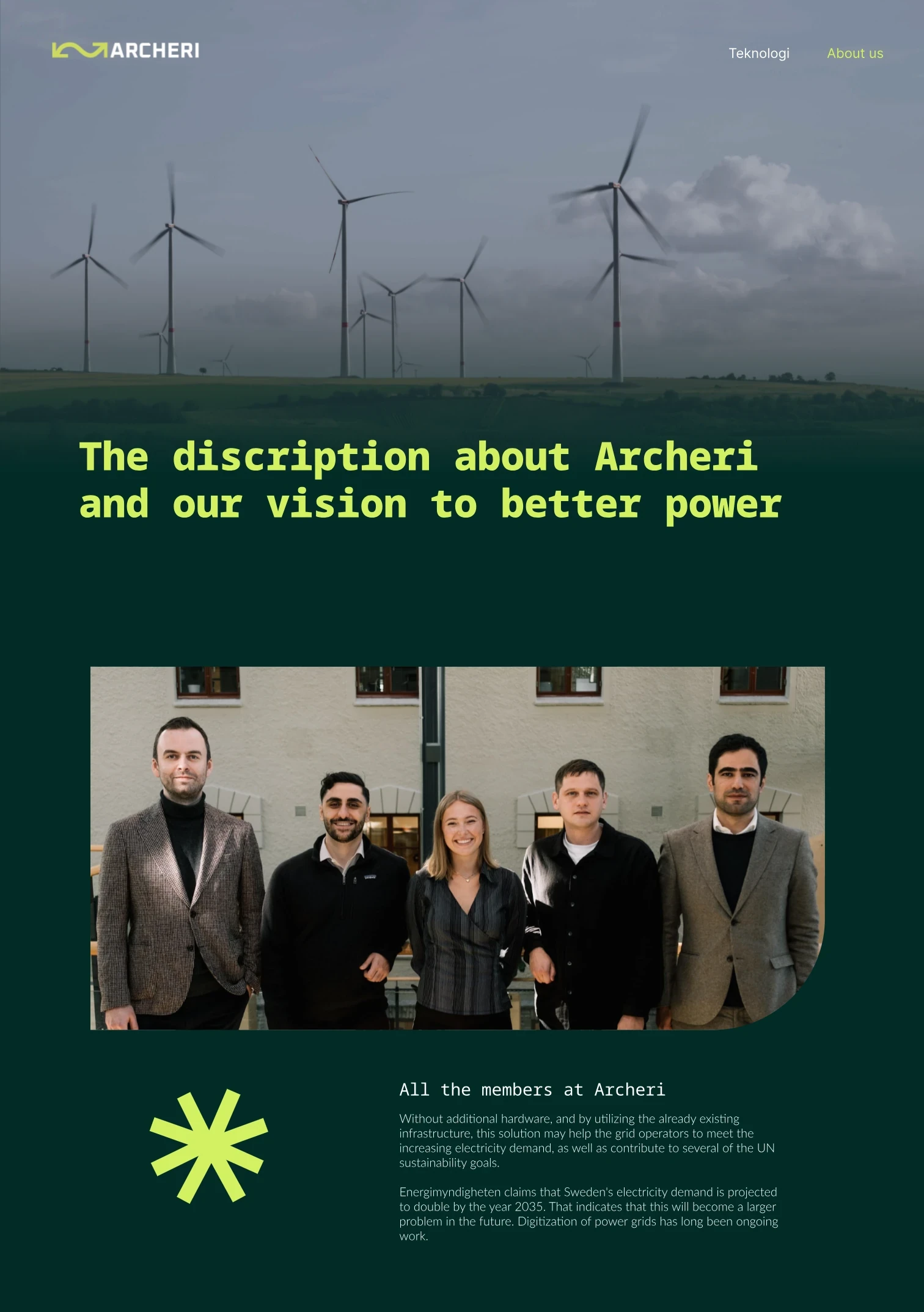
After reviewing the three different proposals, Archeri decided to combine elements from both mine and Katarina’s stylescapes. They chose the "Energy" color, both typefaces, and the illustrations from my proposal. From Katarina’s proposal, they selected the beige background color, color blocks, and images.
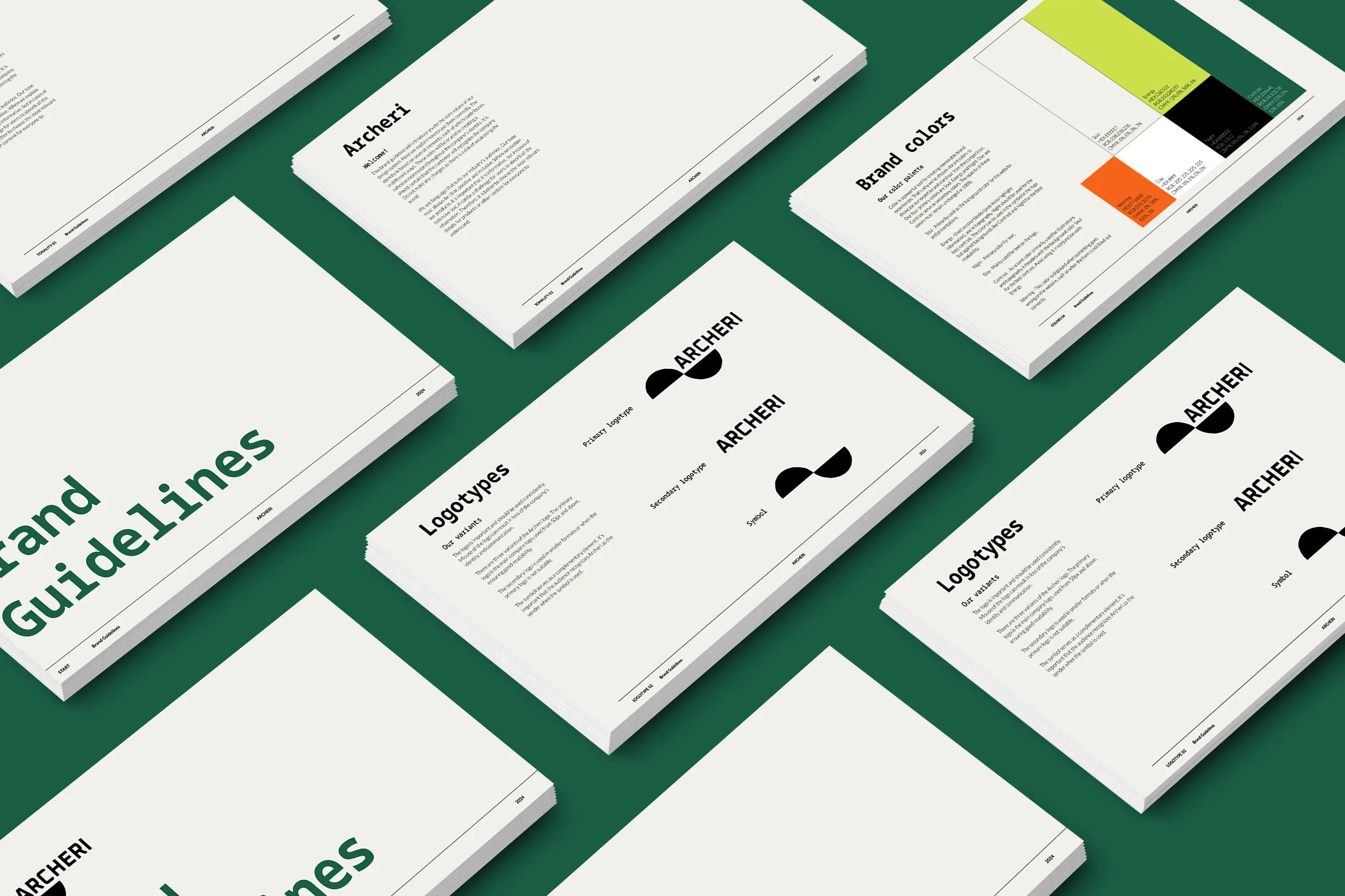
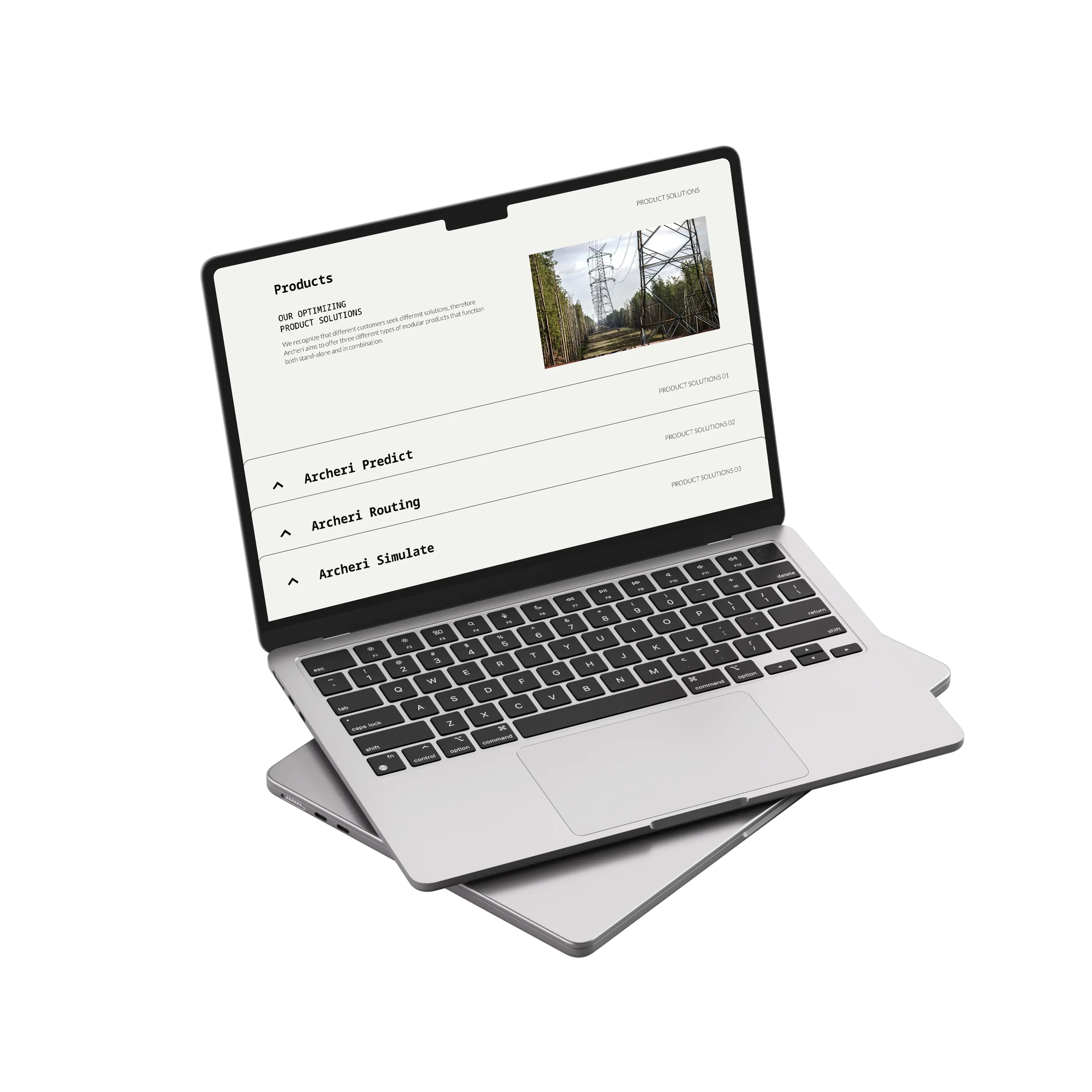
We started by designing the brand guidelines, detailing how the company should communicate with its customers in the right way, including how to use the logo and colors. During our meetings, Archeri provided specific points they wanted included on the website. Our team sketched a greybox to get an overview of the UX design. Once approved, we worked on the website in Webflow.
The information was designed to be simple and easy to understand and navigate, with explanatory images and illustrations.
Reflections
We spent a lot of time on the brand guidelines, which meant that we didn't have as much time to work on the website, even though it should have been a priority. Our planning fell short, and we focused on less important details.
We could have worked more on our sketching since we realized later that some of the design choices we made were not doable or became too complicated when designing in Webflow.
Overall, the collaboration within the group and with Archeri was good. Although they chose not to purchase our design, we thank them for their engagement and wish them the best of luck with their company.


